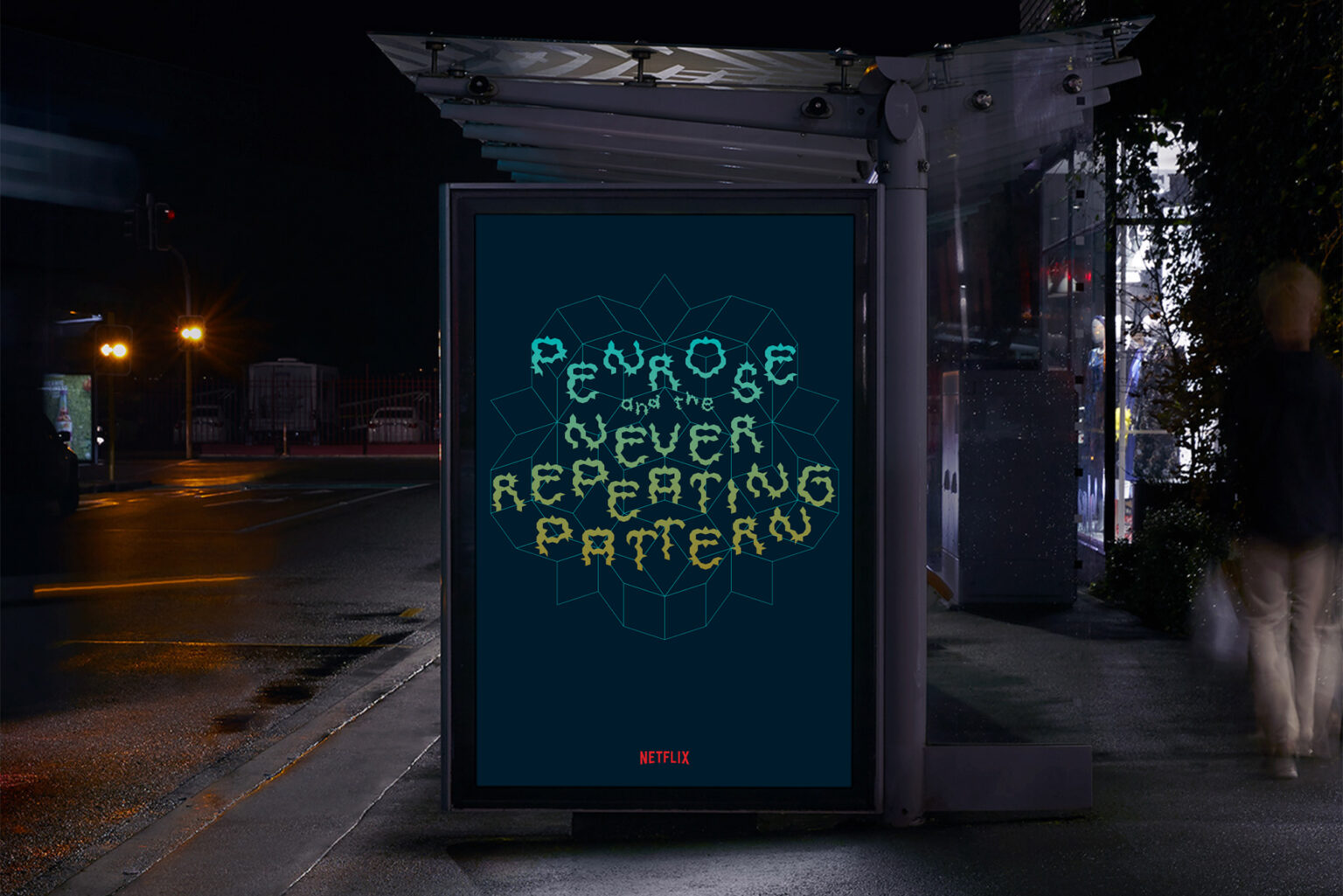
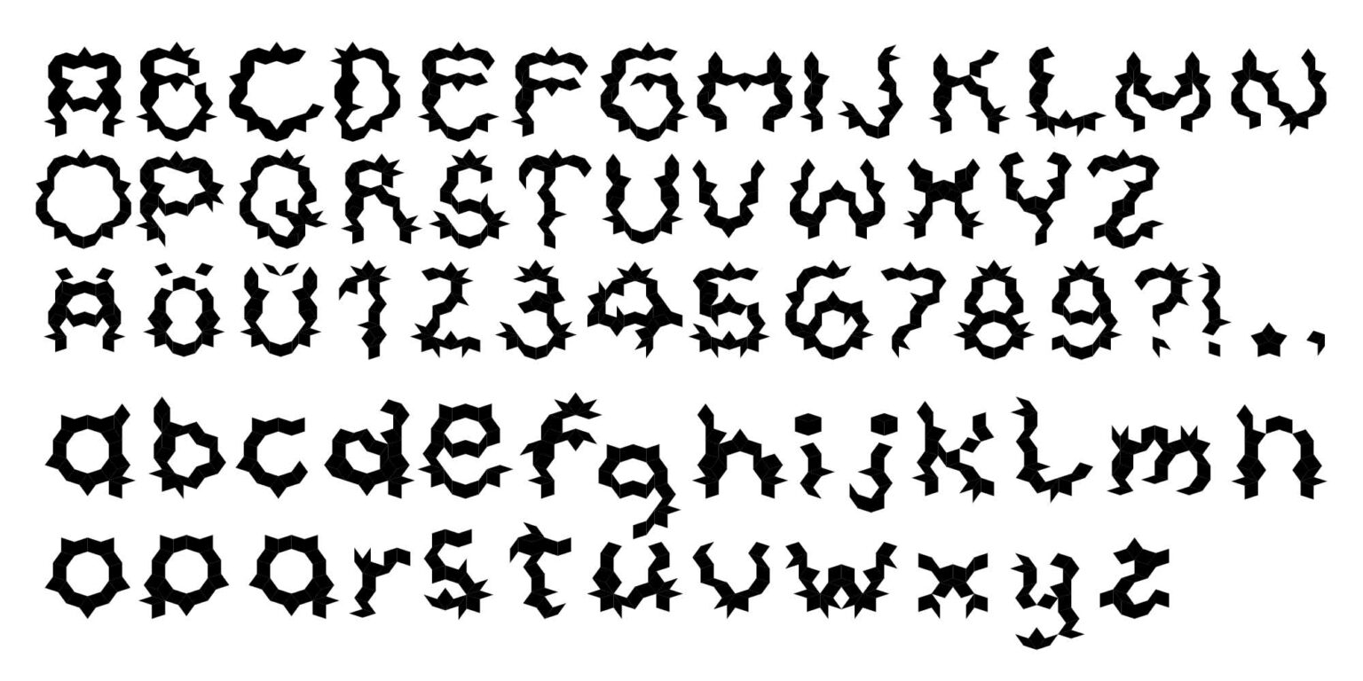
The fascinating Penrose tessellation tiles a plane aperiodically with using only two shapes. I used it as a grid for my type design, a display font fittingly called “Penrose Tile”. Due to it’s characteristic angular look, it fits only special projects, like for instance the poster for my made-up Netflix documentary about Roger Penrose.
More about the theory behind Penrose tessellations can be found in this great video.